Social media
Social media
Social Media Identity
Our visual identity on social media is based on strong typography, iconography and vibrant colours and gradients. Graphic visuals should be mixed with branded photography, helping to differentiate and humanise our communication.
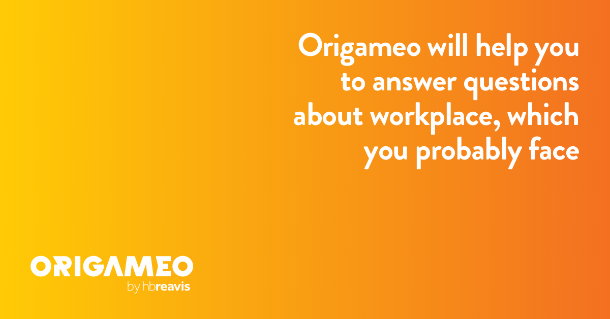
Consider these examples as the recommended way to use our brand standards, combining typography, colours and a logo with key messages and basic UI elements. Please also remember to check your ads with Facebook’s official Image Text Check to keep a 20% text-to-image ratio in your adverts for the best results.


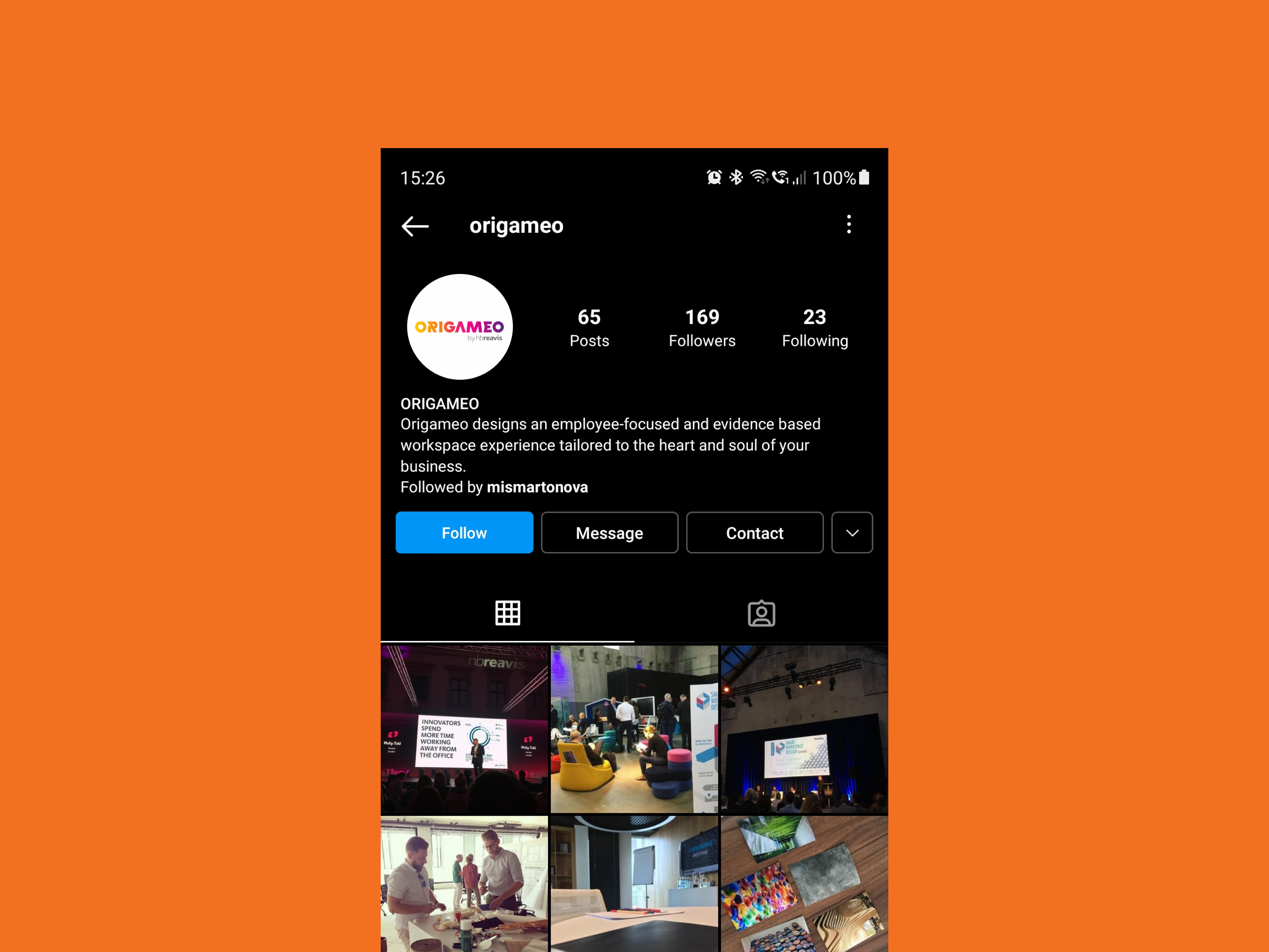
Profile pictures
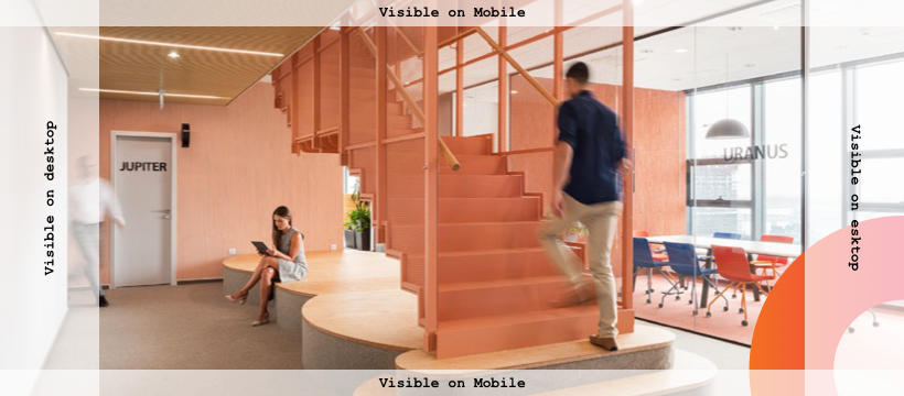
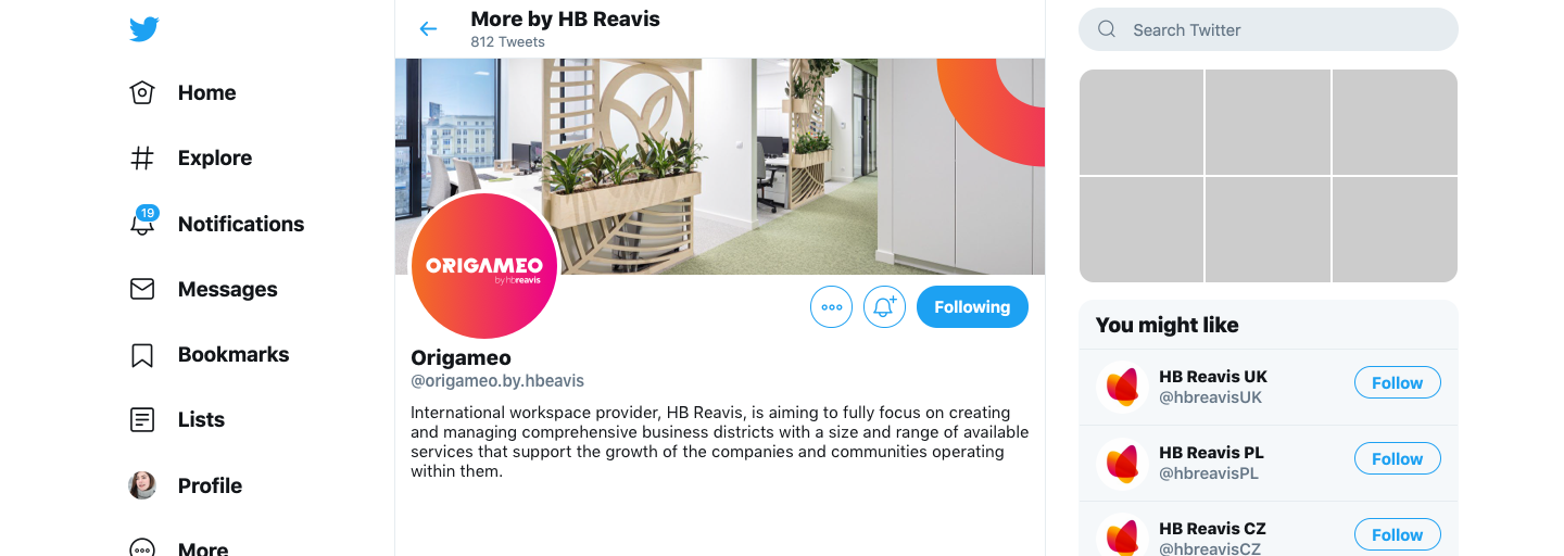
Covers







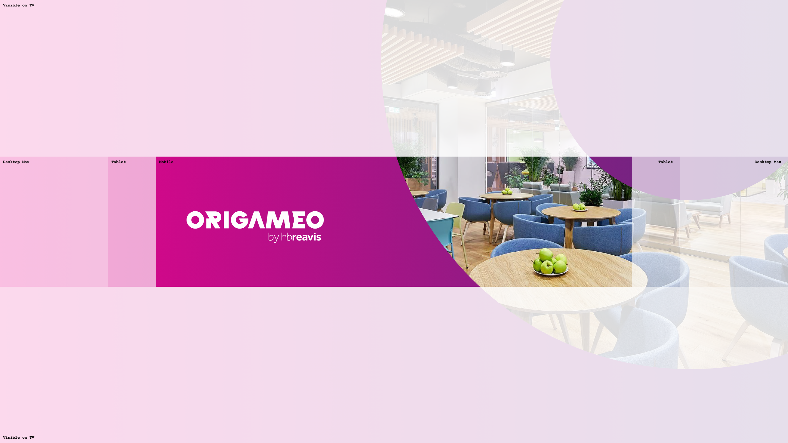
YouTube


Social media
Social Media Posts
Our visual identity on social media is based on strong typography, iconography and vibrant colours and gradients. Graphic visuals should be mixed with branded photography, helping to differentiate and humanise our communication.
Consider these examples as the recommended way to use our brand standards, combining typography, colours and a logo with key messages and basic UI elements. Please also remember to check your ads with Facebook’s official Image Text Check to keep a 20% text-to-image ratio in your adverts for the best results.
Posts
With colour or gradient background


With photo



Linkposts
With colour or gradient background


With photo




Stories
With colour or gradient background


With photo
