Brand
Brand
Logo Wordmark
Origameo colours are colours of passion and vibrancy. Our four main colours reflect our energy, enthusiasm, warmth and passion. Purple reflexts our creativity, too.
Wherever possible, it is always prefered to use a coloured version of the logo. When using a coloured backgrounds, main or gradients, only use a white logo.
In cases where it is not possible or suitable to use a coloured version of the logo, you can use grey or white on dark backgrounds.
Wordmark with endorsement line
Wordmark without endorsement line
Wordmark on light, dark and coloured backgrounds
Coloured wordmark
Examples of use of coloured wordmark on light and dark backgrounds.
White wordmark
Examples of use of white wordmark on coloured and dark backgrounds.
Dark grey wordmark
Examples of use of grey wordmark on light backgrounds.
Wordmark on photographic background
Only use a white or dark grey logo when using a photographic background.
Examples of use of wordmark on a photographic background.
Use with other logos
Brand
Colours
Origameo is a service brandfrom the house of brands byHB Reavis. As such, the brand values should be in line with HB Reavis’ brand values.
Always use the correct colour palette.
Our four primary colours reflect our warmth and passion. Use them at 100% opacity in general, except corporate graphs as complementary colours at 60% opacity.
Secondary colours combine with our primary colours to communicate our vibrant brand.
Primary colours
Secondary colours
White and Black
Gradients
Brand
Brand Element
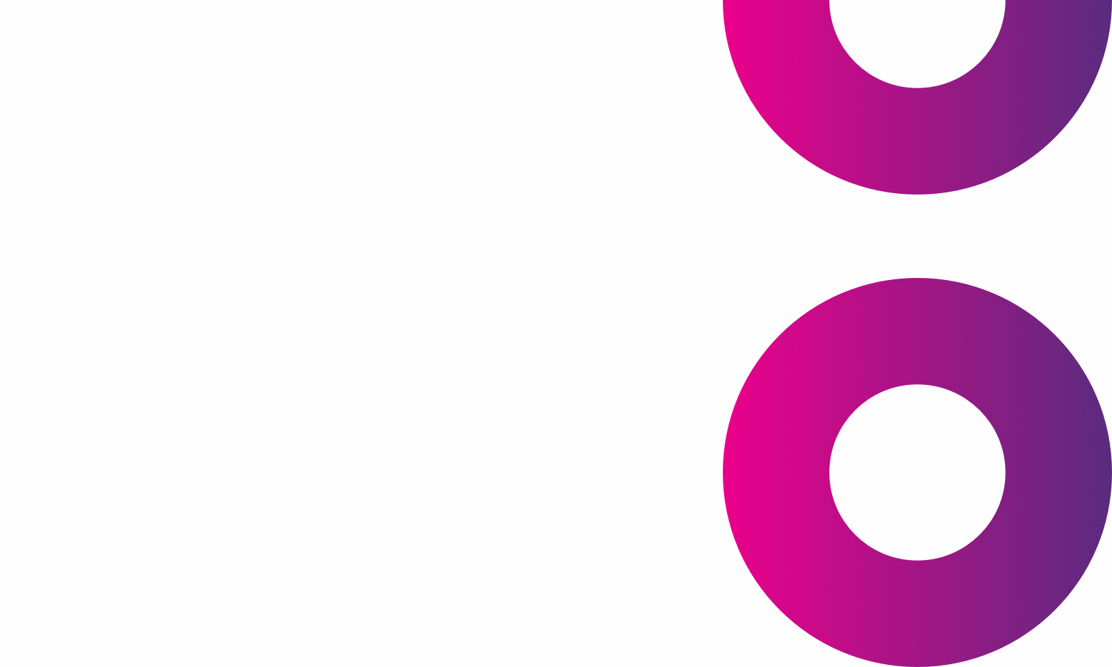
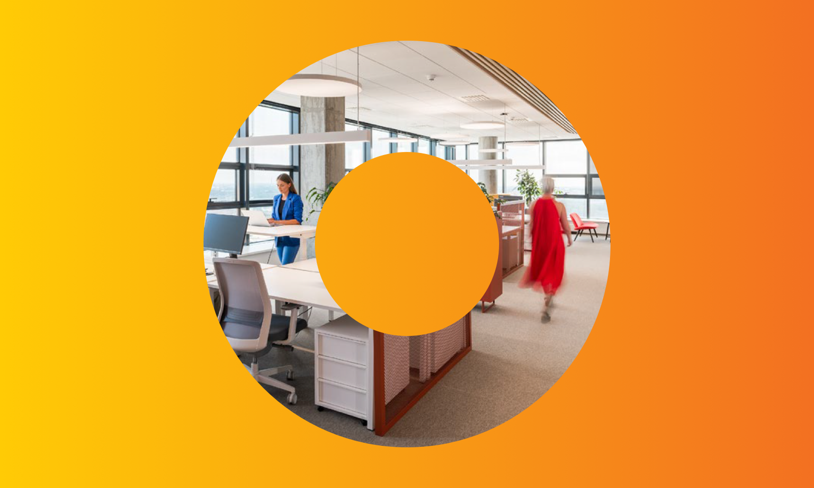
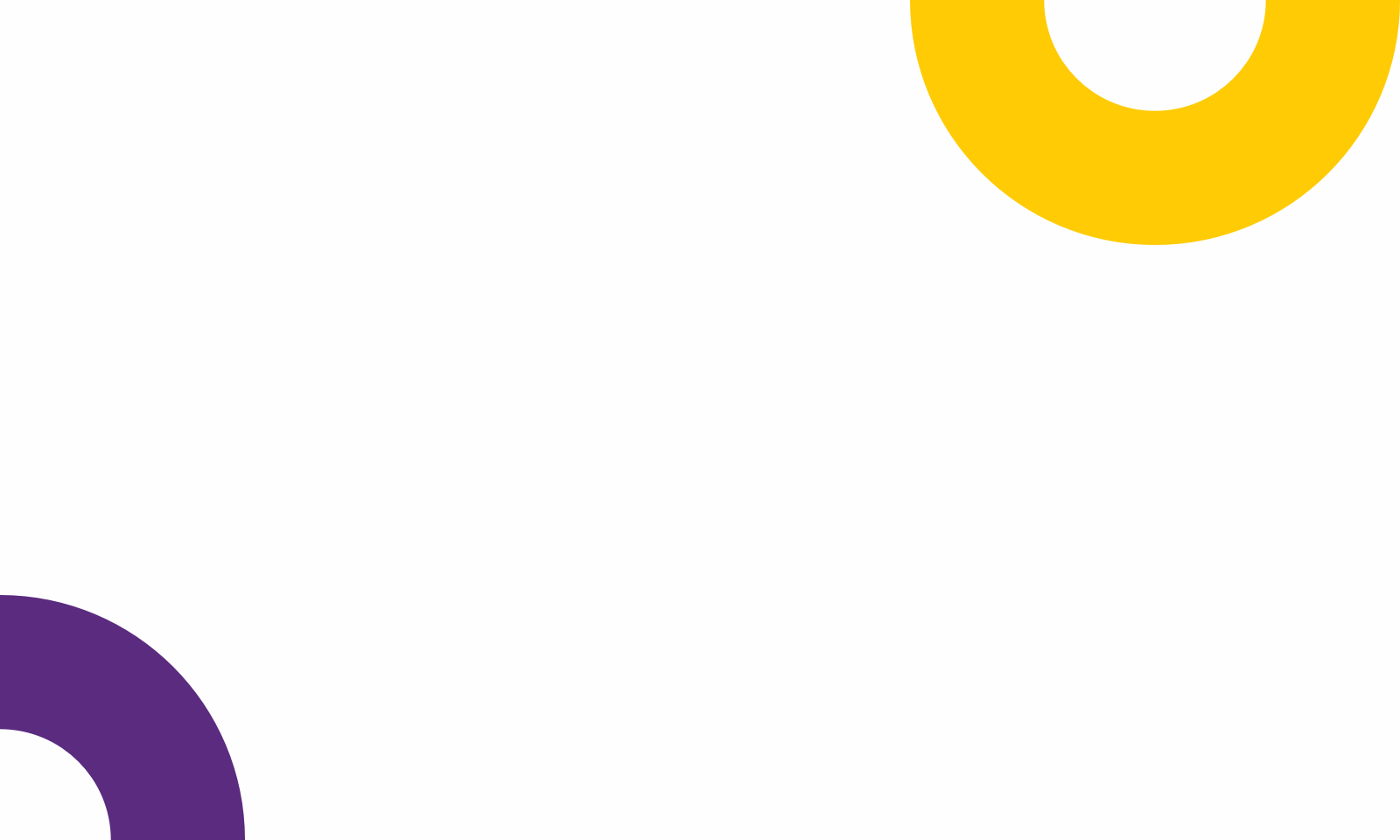
The “O” shape came out from the logomark and stands out to proof brands’ wholness. It represents cycle, continuing action and constant movement. Use the “O” or its part to add texture to backgrounds and imagery.
Brand element use in primary colours for PPTX, Excel, Word or any official corporate documents. Use maximum 2 colours gradients for digital use or print creatives.
Primary colours
Gradients
Examples of use


Brand
Typography
Brandon Grotesque’s clear, geometric style is warm and distinctive. Importantly, its sans serif typeface also enhances our engaging, open-minded personality.
Avenir is clear and nicely readable in heavier text.
Typefaces
Use Brandon Grotesque family typeface for Headings, Titles and Statements. For everything else, use Avenir LT Pro.
Brandon Grotesque
Brandon Grotesque
AaBbCcDdEeFfGgHhIiJjKkLlMmNnOoPpQqRrSsTtUuVvWwXxYyZz1234567890!@£#$%^&*()
Avenir LT Pro
Avenir LT Pro
AaBbCcDdEeFfGgHhIiJjKkLlMmNnOoPpQqRrSsTtUuVvWwXxYyZz1234567890!@£#$%^&*()
Hierarchy
In order to help our brand remain consistent around the globe, we use this simple hierarchy style as a guide.
Brandon Grotesque Bold, 52pt / 60pt
Brandon Grotesque Bold, 38pt / 54pt
Brandon Grotesque Bold, 30pt / 36pt
Brandon Grotesque Bold, 24pt / 28pt
Brandon Grotesque Bold, 20pt / 24pt
Brandon Grotesque Bold, 16pt / 20pt
Avenir LT Pro Roman, 20pt / 32pt
Avenir LT Pro Heavy, 20pt / 32pt
Avenir LT Pro Roman, 18pt / 28pt
Avenir LT Pro Heavy, 18pt / 28pt
Avenir LT Pro Roman, 16pt / 24pt
Avenir LT Pro Heavy, 16pt / 24pt
Avenir LT Pro Roman, 13pt / 20pt
Avenir LT Pro Heavy, 13pt / 20pt
Brandon Grotesque Regular, 28pt / 30pt
Font colours
Brand
Iconography
Our icons are formed from a continuous line, reflecting our restlessness for innovations and ideas. We recommend they are used in a fun and light way, without overloading the page with too much detail.
Line icons
UI icons
Brand
Photography
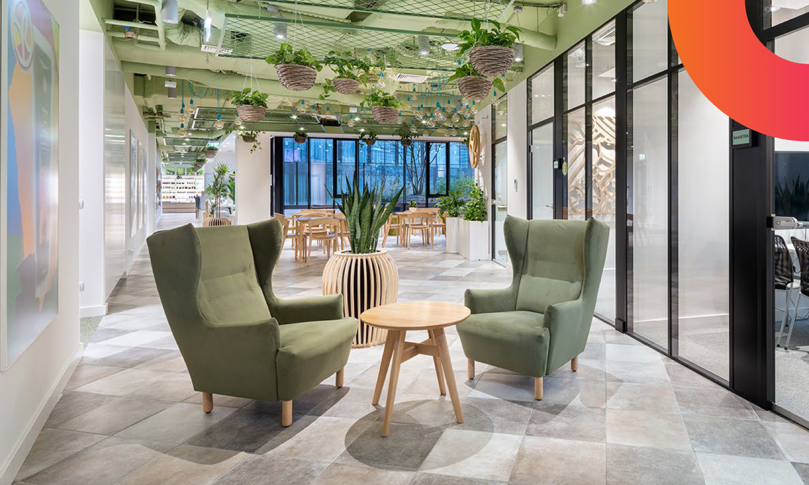
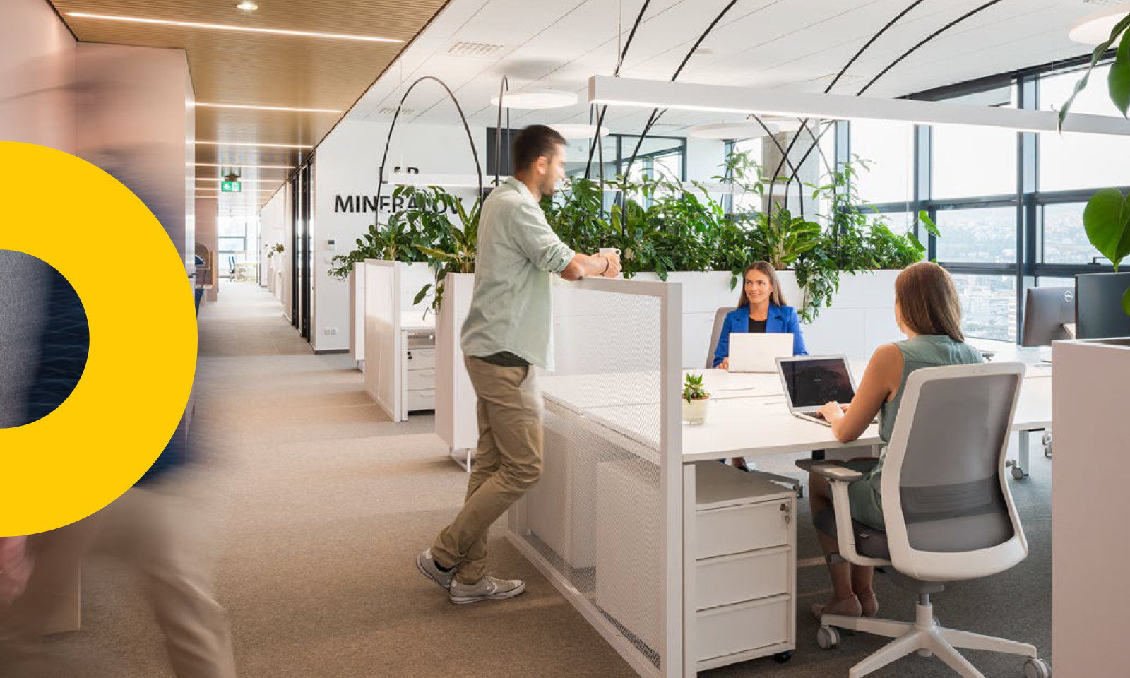
Workspaces
Messages that come through our photographic style are passion and team spirit. We should show life in our workspaces.
Shots sometimes illustrate excitement, about projects or the journey to their fruition; and at other times it celebrates details — as they are crucial to our success. Nothing feels staged or fake. Every shot captures a moment of natural emotion.
Construction sites: If taking photographs on construction site (project in preparation), keep in mind it sould highlights the health and safety practices, ensuring our exemplary standards are maintained. It also deals with the composition rules of any photos taken.
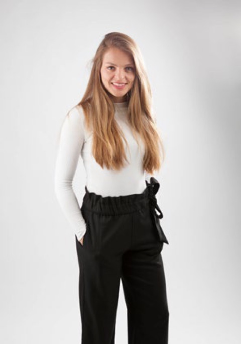
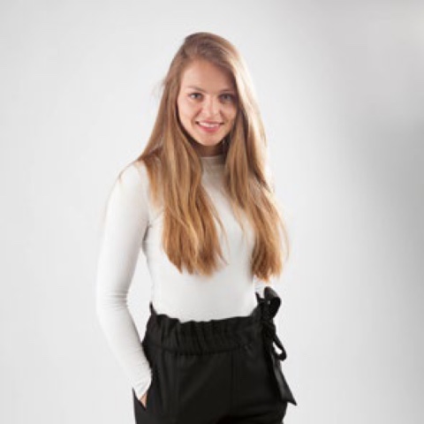
Profile photography
Steer clear of images of people wearing formal business attire. Why? Because we don’t want to look overly corporate. It’s not who we are, or what we wear day-to-- day. We can still work professionally and dress stylishly without suits, ties or scarves. And don’t forget that smile and honest look is the best first contact even on photo.
Full length examples


Square examples


Round colour examples