Prior to designing a communication, take a moment to consider its tone. Is it warm? Corporate? Consumer-focused? Exciting?
Choose a pulse that reflects that tone and then use it to create a theme for the rest of the communication.
We offer a diverse range of services and solutions so our brand also uses a diverse palette. Change is our only constant. This restless pursuit of new innovations is expressed by our use of colours.
Related: Themes
These are our six primary colours and its hues. We suggest using maximum 3 colours at a time.
Use: Headlines, Buttons, Badges, Icons, Pagination and Slide Controls. Overlays at 30% opacity.
Yellow 700
#ffcb05
Yellow 600
#FFD537
Yellow 500
#FFDE64
Yellow 400
#FFE68B
Yellow 300
#FFEEB1
Yellow 200
#FFF6D8
Yellow 100
#FFFBEB
Orange 700
#f37021
Orange 600
#F48542
Orange 500
#F6975E
Orange 400
#F8B186
Orange 300
#FACAAE
Orange 200
#FCE5D6
Orange 100
#FEF2EB
Raspberry 700
#ed135d
Raspberry 600
#F03977
Raspberry 500
#F2558A
Raspberry 400
#F580A7
Raspberry 300
#F8AAC4
Raspberry 200
#FCD4E2
Raspberry 100
#FDEAF0
Violet 700
#810c90
Violet 600
#90299D
Violet 500
#9C3FA7
Violet 400
#B56FBD
Violet 300
#CD9FD3
Violet 200
#E6CFE9
Violet 100
#F3E7F4
Green 700
#a6ce39
Green 600
#B3D556
Green 500
#BFDC72
Green 400
#CFE595
Green 300
#DEEDB8
Green 200
#EFF6DB
Green 100
#F7FAED
Blue 700
#0db0cd
Blue 600
#31BBD4
Blue 500
#50C5DA
Blue 400
#7CD4E3
Blue 300
#A7E1EC
Blue 200
#D3F0F5
Blue 100
#E9F8FA
Use: White, Grey 0, 1, 2, 3, 4 and 5 for Text, Icons, Dividers, Borders and Buttons. Grey 6 and 7 for Backgrounds and Disabled Elements. For Overlays use Grey 1 or White at 30% opacity.
Neutral 900
#191A1A
Neutral 800
#414344
Neutral 700
#686c6d
Neutral 600
#979b9b
Neutral 500
#BEC0C0
Neutral 400
#D6D7D7
Neutral 300
#E3E4E4
Neutral 200
#F1F1F1
Neutral 100
#F8F8F8
Neutral 000
#fefefe
Notice
#0db0cd
Positive
#a6ce39
Warning
#ffcb05
Negative
#f1523e
We recommend you use our icons in a fun and light way without overloading the page with too much detail. Our icons can be used in any of our approved primary colours. When using icons on top of a pulse, they should only be in a solid black or white.
Download icon packOur one line icons are formed from a continuous line and reflect our pursuit of innovations and ideas. Any illustrations should feel fluid and hand drawn, using a continuous line with no sharp angles or harsh edges. They should feel energetic whilst still looking graceful.
In addition, we also use solid icons in places where they could be visually more effective than one line icons. But the feel of these illustrations remains the same.
Our UI icons are designated for use in Small Sizes, Inputs and Buttons only.
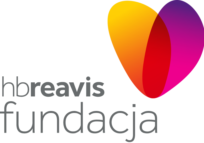
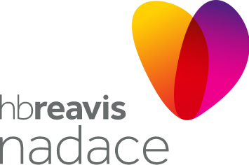
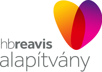
Our logos consist of a word mark and a logo mark.
Every logo mark is elegantly balanced. The word mark and shapes that create the pulse must never be altered. The two elements can however be used independently. The logo must never be cropped, stretched, condensed or distorted.
The word mark is our most versatile identity. Never boxed off or placed within a frame, it must only appear in our chosen grey or white. The word mark must never use any other typeface.
The word mark's lower case communicates openness and friendliness. The rounded typeface and dot on the 'i' expresses a soft, approachable yet still professional tone. Used across all our communications, it reflects our personality and helps us to connect with our audience on a more human level.
The grey word mark is the primary version for all white and light coloured backgrounds. It should not be used over a pulse or any background where legibility is impeded.
The white word mark is the primary version for placing over pulses, images and other darker backgrounds. The white version should not be used on light backgrounds or where legibility is impeded.
Download logo pack (PNG)A key element are our pulses. These are part of a series of organic shapes that embody our personality. They reflect our fluid approach to change, are consistent with the series and tell a story of growth, innovation and inspiration.
The warm vibrant colours visualise how our passion for the work we do is infectious to everyone we meet.
Download logo pack (PNG)We have reduced the weight of the Foundation word mark to retain the emphasis on the HB Reavis word mark while still retaining the eye-catching quality of the word 'Foundation'.
The pulses’ visual softness demonstrates that we are human and people‐centric. And the combination and curvature of two shapes celebrates the way we collaborate and embrace new innovations.
Related: Logos
We use Brandon Grotesque which enhances our engaging, open‐minded personality. We also use Avenir across Mac and PC platforms where Brandon is not available. Importantly, it must never be used as a secondary typeface. However, if it is not available or inappropriate, use Arial.
Related: Colours Grid system Text sections
Use Brandon Grotesque family typeface for Headings, Titles and Statements. For everything else, use Avenir LT Pro.
Brandon Grotesque
AaBbCcDdEeFfGgHh
IiJjKkLlMmNnOoPpQq
RrSsTtUuVvWwXxYyZz
1234567890!@£#$
%^&*()
Avenir LT Pro
AaBbCcDdEeFfGgHh
IiJjKkLlMmNnOoPpQq
RrSsTtUuVvWwXxYyZz
1234567890!@£#$
%^&*()
Use Grey 0, Grey 1, White or any other primary colours for Headings. Use Grey 1 or Grey 2 for Body Text and Grey 3 and 4 for less important text as Captions, Placeholders or Disabled Elements.
In order to help our brand remain consistent around the globe, we use this simple hierarchy style as a guide.
Brandon Grotesque Regular, 52pt / 60pt
Brandon Grotesque Regular, 38pt / 54pt
Brandon Grotesque Regular, 30pt / 36pt
Brandon Grotesque Regular, 24pt / 28pt
Brandon Grotesque Regular, 20pt / 24pt
Avenir LT Pro Heavy, 16pt / 20pt
Avenir LT Pro Roman, 20pt / 32pt
Avenir LT Pro Heavy, 20pt / 32pt
Avenir LT Pro Roman, 18pt / 28pt
Avenir LT Pro Heavy, 18pt / 28pt
Avenir LT Pro Roman, 16pt / 24pt
Avenir LT Pro Heavy, 16pt / 24pt
Avenir LT Pro Roman, 13pt / 20pt
Avenir LT Pro Heavy, 13pt / 20pt
Brandon Grotesque Regular, 28pt / 30pt